When Hallstar came to Movéo, they were a leading global specialty chemical company, but their outdated image did not reflect that standing. They wanted to develop a vibrant new corporate brand that showcased their successful evolution into a highly differentiated, customer-focused company.
Our team first conducted research to determine the true value of what Hallstar offers its customers, and used these findings to develop a brand strategy. This effort culminated in a total redesign of the company’s web site, providing the appearance and functionality they needed.
Although many manufacturing and consumer products businesses need unique ingredients for production, most chemical companies avoid working in small batches because it’s not always cost efficient. Hallstar stands out — it offers its customers the option to order custom chemicals in small batches. Say you want to create a 50 SPF sunscreen that feel likes a lotion. Hallstar has the expertise and facilities to create the perfect product in small batches.
It was clear this was the differentiating factor to emphasize in Hallstar’s brand refresh. The new brand and tagline we developed, LET’S WORK WONDERS™, celebrates the idea that Hallstar creates unique chemical combinations in affordable batches.
User experience and advanced metrics
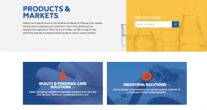
As we discussed in a recent post on user experience, it’s essential that every customer can easily find the information and resources they need on a website. Hallstar offers a range of unique solutions in a variety of industries. To make navigating the information on their site seamless, we created personas based on each customer type, and developed customer journey maps for each persona. These served as the foundation for a completely new site architecture. For example, the two largest markets Hallstar operates in are industrial materials and beauty and personal care. A customer looking to create a heat-resistant tire would only need to click “Products and Markets” from the homepage and immediately see “Industrial Solutions” as an option to move deeper into the site.

Screenshot from: www.hallstar.com/products-and-markets/
We also developed a framework to define what we’d measure going forward. Because we wanted to monitor the results of our user experience redesign, it was important to understand which metrics best indicated engagement and conversion at each level of the customer journey.
First, we pinpointed five stages of the customer journey, each one aligning with a point in Hallstar’s sales funnel. We then developed a comprehensive set of measurements for each stage, and now use metrics such as non-bounce visits to analyze engagement at the beginning of the journey and registrations at the end.
Responsive design
Before Hallstar partnered with Movéo, their site was outdated and difficult to use. Because the goal of the user experience redesign was to optimize the way that users travel through the sales funnel, it was important to have a responsive website, which has been shown to generate more leads. We wanted to complement the new, user-focused site architecture with a beautiful, responsive design that ensured Hallstar’s message was communicated to everyone, no matter what format they viewed it in.
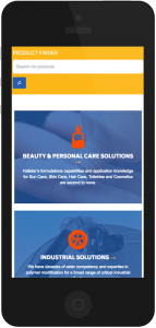
We used a responsive, collapsible grid system that reorganizes the content based on screen size and better suits the finger-scrolling motion on mobile touchscreen devices. This way, if that heat-resistant tire designer is browsing Hallstar’s services on a smartphone, they’ll see the Industrial Solutions link displayed clearly across the full-width of their screen, instead of crowded horizontally with Beauty & Personal Care.

Screenshot from: www.hallstar.com/products-and-markets/
The redesign increased engagement dramatically. Overall site visits have increased almost 30 percent since last year. Not only is the site getting more traffic, but users are also staying longer and travelling deeper into the site. In the last year, average visit duration has improved 40 percent and non-bounce visits have improved 50 percent.
In addition to improving user experience and adding a responsive layout to the Hallstar site, we also added new functionality, which you can learn more about here. The foundation for the entire project began with an in-depth analysis of Hallstar’s value proposition and the heart of their brand. To learn more about what makes brands strong, check out “10 simple truths about strong brands.”